Showing posts with label Tim Holtz. Show all posts

Thursday, 4 January 2018

Happy New Year! ¡Feliz Año Nuevo!

¡Hola!

Jo, no me había dado cuenta de que la última entrada es de hace mes y medio. Buff... el mes de diciembre ha sido un devenir contínuo de actividad, y aunque he seguido haciendo trabajos, no los he estado publicando (o, si acaso, en mi cuenta de Instagram @gallegomaite).

Voy a enseñaros uno de mis trabajos e iré publicando el resto durante el mes de enero.

Se trata de un layout que he hecho para regalar en Reyes. Me inspiré en uno creado por Gabrielle Pollacco para la distribución de los elementos decorativos, aunque los resultados son bastante diferentes (podéis comprobarlo aquí). He utilizado papeles de Maja Design, 49&Market y Photoplay. Los chipboard son de Kora Projects y otro del bazar, y están embosados con Snowflake Tinsel de Ranger. Hay flores de 49&Market, Dovecrafts y Kora Projects, y el Stencil utilizado es de The Dusty Attic. Los brads son de Artemio. Aunque apenas se aprecia en la foto, utilicé el Moon Shadow spray de Lindy's en el tono Tawny Turquoise sobre el papel de tonos metálicos. Fotos, fotos, fotos: 


A mi cuñada le gustan mucho las mariposas, así que no podían faltar. Estas son recortes de Vintage Artistry, Flora and Fauna de 49&Market. 


Me ha gustado mucho combinar colores variados y diseños florales con motivos industriales. Creo que queda bastante bien. 


Flores y más flores, me encanta usarlas. Estas flores planas de Dovecrafts quedan genial en esa abertura. Apenas se aprecia, pero hay un chipboard de Kora también.  


El rub-on es de Tim Holz, y me recuerda a la letra de una canción que les encanta a mi hermano y a mi cuñada. 

Espero que os haya gustado. ¡Gracias por entrar en el blog!

Maite

P.D.: Te animo a ser mi primer/a suscriptor/a... ¿sí?

Monday, 11 September 2017

Life is but a dream

Llegamos al final del verano y no sé si es lo normal o no, pero me encuentro en la siguiente situación: muchas fotos totalmente scrapeables, y restos de material que no van con ninguna de ellas. De hecho, la foto del trabajo que os presento hoy primero fue candidata a ser scrapeada con un esquema de colores totalmente distinto y una temática completamente diferente, y como al final no "lo veía", decidí visitar la estupenda Komola Krafts y surtirme de material adecuado para el proyecto. 


We've almost made it to the end of the summer, and I've no idea if it's a common thing or not, but this is the situation I'm in-- I have lots of scrappable pictures, and remnants of material that don't go with any of them. In fact, the picture I'm going to show you on this post was first supposed to go with a project in a completely different colour scheme and a theme that had nothing to do with this one. In the end, I couldn't make it work, so I decided to pop into Komola Krafts and get some supplies for this project. 


Para este layout, he utilizado papel de 49 & Market (Vintage Artistry Flora & Fauna y Scents of Nature-Clockworks), y cartulina texturizada de Bazzill (Diamonds). Decidí una composición en la parte inferior izquierda, y con adornos del mundo natural. El contorno está distresado y entintado con Distress Ink en Pumice Stone. 


I've used paper from 49 & Market (Vintage Artistry Flora & Fauna and Scents of Nature-Clockworks), and texturised cardstock from Bazzill (Diamonds). I went for a composition on the lower left-hand side and natural-world embellishments. The outer edge has been distressed and inked using Distress Ink in Pumice Stone. 


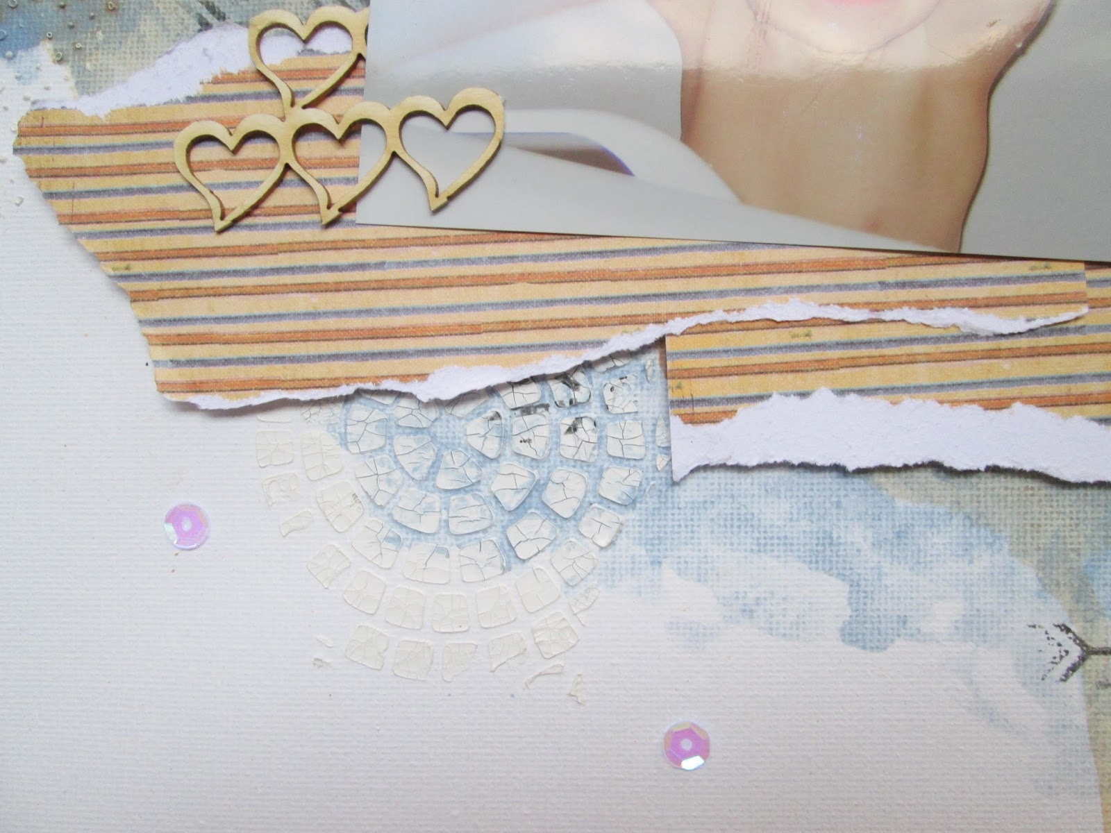
En la parte superior derecha, añadí una zona de interés con unas hojas recortadas y cubiertas con Crackle Accents, algo de gasa, y otros elementos tales como unas lentejuelas, gemas marrones y perlas. El rizo, de Kora Projects, ha sido pintado de verde y lleva una ligera capa de Liquid Pearls. También se aprecia un stencil de hojas en el fondo. 

On the upper right-hand side, I added another interest area- some leaves covered in Crackle Accents, some cheesecloth, and other elements such as sequins, brown gems and pearls. The curl, by Kora Projects, has been painted green and given a coat of Liquid Pearls. You can also make out a leaves stencil on the background.


A la derecha de la fotografía, hay más hojas de helechos, cubiertas con Crackle Accents, y flores con gotitas de Glossy Accents. El chipboard es de Kora Projects, y siguiendo los consejos de Antonia en esta entrada del blog de este fabricante, he levantado las hojas para darle un aspecto tridimensional. Están pintadas con acrílica verde y llevan Liquid Pearls. Los sellos del fondo son de Kaiserkraft, y están estampados con Distress Ink en el tono Mowed Lawn. 


There are some more fern leaves to the right of the picture, which have also been given Crackle Accents, and some flowers which have Glossy Accents on their petals. I've taken Antonia's advice on this entry for the Kora Projects blog, and I've opened up the leaves of the chipboard used to give it a 3D effect. The stamps are by Kaiserkraft and have been stamped using Distress Ink in Mowed Lawn. 

Bajo los rasgados hay cartón corrugado pintado de blanco con gesso, y adornado con unas gemas marrones y lentejuelas. 


Underneath these tears there's some corrugated cardboard. It was painted using white gesso and embellished with sequins and brown gems. 


 En las siguientes fotos, se pueden apreciar las capas del proyecto. 


You can see the project layers here.


Espero que os haya gustado. ¡Gracias por entrar en el blog!


I hope you liked it. Thanks for popping in!


Maite

Monday, 4 September 2017

Scrapbooking party-#pic of the day layout

¡Hola! 

Aunque hacer trabajos de scrap suele ser una labor individual, no tiene por qué ser solitaria. De hecho, mi introducción a este mundillo fue gracias a una quedada de amigas, en la que una de ellas, Antonia de Cáscara de Papel, nos enseñó técnicas básicas de scrapbooking. Fue una experiencia muy bonita y con gancho, y afortunadamente, hemos repetido. 


Hi!

Even though doing scrapbooking projects is usually an individual task, it doesn't have to be a lonely one. In fact, my introduction to this was because some friends and I met because we wanted one of them, Antonia (visit her blog Cáscara de Papel) to show us basic scrapbooking techniques. It was a lovely experience which hooked us up, and fortunately, we've done it again.

Fue hace unos días, y esta vez ya sabíamos que no nos iba a dar tiempo de tomar té con pastas (es un decir) mientras hacíamos nuestros trabajos. En lugar de usar papel, nos decantamos por un lienzo. A mí me encanta la idea de construir mi propio fondo, pero todavía me veo un poco inexperta y pensaba que tanto blanco me bloquearía. 


It happened a few days ago, and this time we were all aware we wouldn't have time for tea and biscuits while we worked, so to speak. Instead of paper, we went for a canvas. I love the idea of building up my own background, but I must say I don't consider myself skilled enough for it and I thought the blank canvas would give me scrapper's block.

Empezamos por aplicar pasta de textura que craquela en el fondo. Yo utilicé dos plantillas distintas, las dos de Tim Holtz (creo), y las puse de forma un tanto azarosa por aquí y por allí. Una vez se empezaron a craquelar, aceleramos el proceso con la pistola de calor, y pusimos unos sellos. No muchos, la verdad, pero como el mantra era "menos es más", lo dejamos así. 


We began by applying crackle texture paste on the canvas. I used two different stencils by Tim Holtz (I think), and applied them quite randomly. Once they started crackling, we sped up the process with a heat gun and then, proceeded to stamp. I didn't use a lot of stamps, truth be told, but my mantra was less is more, so I left the background just like that. 

Llegó el momento divertido: pintar. Elegí dos tonos de pintura acrílica de The Dusty Attic. Me encantaron los dos, aunque Antonia llevó unas botellitas "mágicas" de Lindy's que me parecen fascinantes pero que no me convencieron para este proyecto en particular. Me puse a pintar con pincel, y a secar, a pintar otro poco más, a secar, a manchar y dejar correr la pintura, a secar... y el resultado me encantaba. 


Then, the fun part: painting. I chose two colours of acrylic paint by The Dusty Attic. I fell in love with both of them, even though Antonia brought a few of Lindy's magic bottles which I found fascinating, but which I didn't fancy for this particular project. I started to paint using my paintbrush, then I dried the paint, then I painted a bit more, then I dried it again, then I splashed some paint and let the colours run, then dried... and I just loved the way it all looked.

Siguiente: papel. Acabé eligiendo un único diseño con los colores principales del trabajo, y decidí no sobrecargarlo con más tonos y más diseños. De nuevo, "menos es más", y con tres rasgones de papel hubo suficiente. 


Next, paper. I ended up choosing a single design which had all the colours in the project, and I chose not to overload it with any more colours and designs. Again, less is more. I tore the sheet in three bits and that was enough.

Por último, unos chipboard de Kora Projects, unas lentejuelas transparentes pegadas según cayeron, y una pincita diminuta pintada con el mismo tono azul que el fondo. Ahí lo tenéis... ¿qué os parece? 


Last, some chipboards from Kora Projects, some sequins sprinkled on top and glued in the place where they had fallen, a tiny clothes peg painted the same shade of blue... there you have it. What do you think?


¡Gracias por entrar en el blog!

Thanks for popping in!

Maite